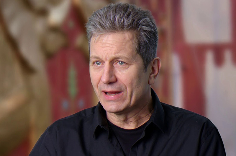
Walt Disney Pictures provided ComingSoon.net with the chance to chat 1:1 with noted production designer Rick Heinrichs (Star Wars: The Last Jedi, Captain America: The First Avenger) about working once again with director and longtime collaborator Tim Burton (Dark Shadows, Sleepy Hollow) on the live-action Dumbo, which is now available on Digital HD, Blu-ray, DVD and 4K. Check out the interview below!
RELATED: From The Set: How the New Dumbo Differs from the Original Movie
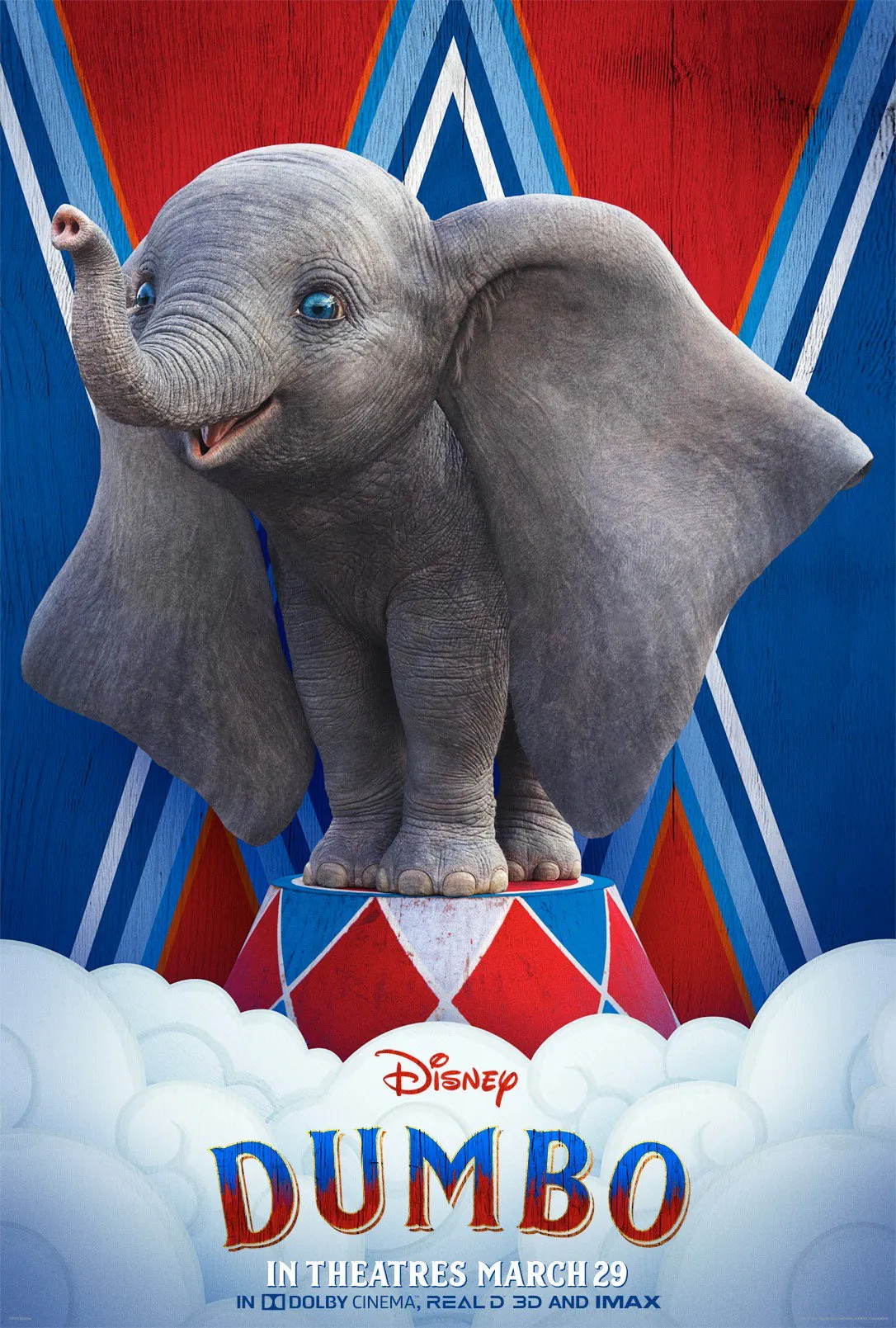
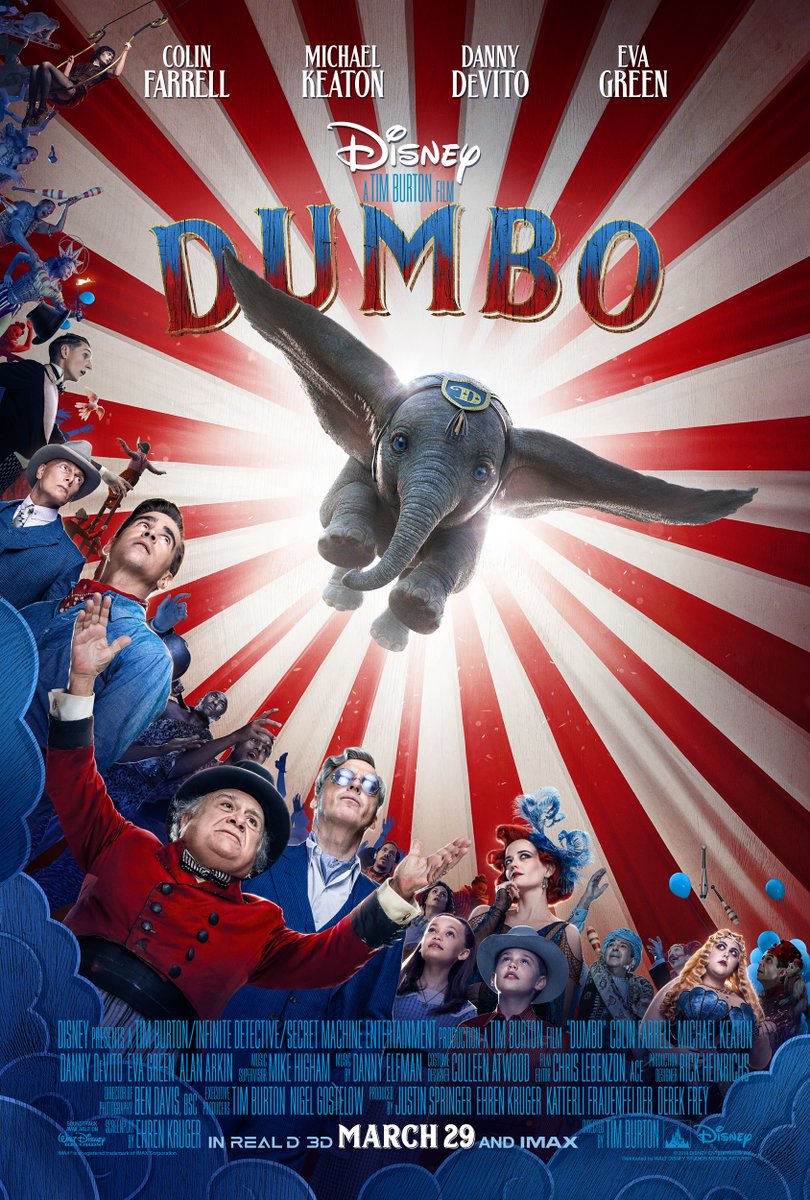
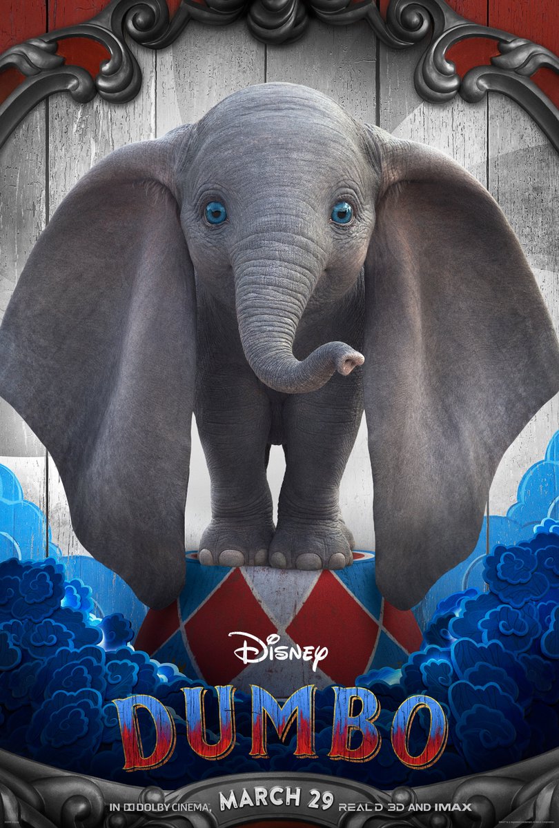
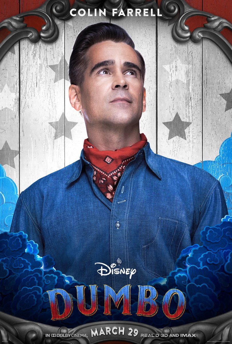
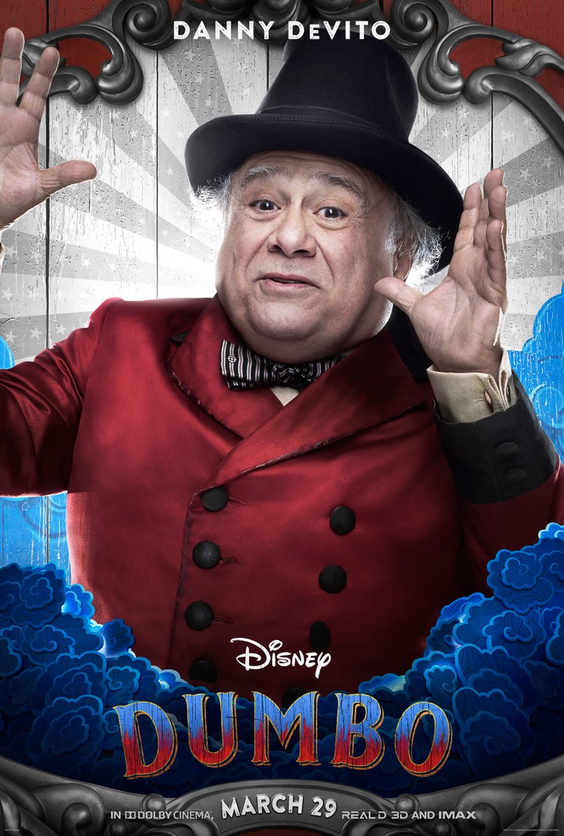
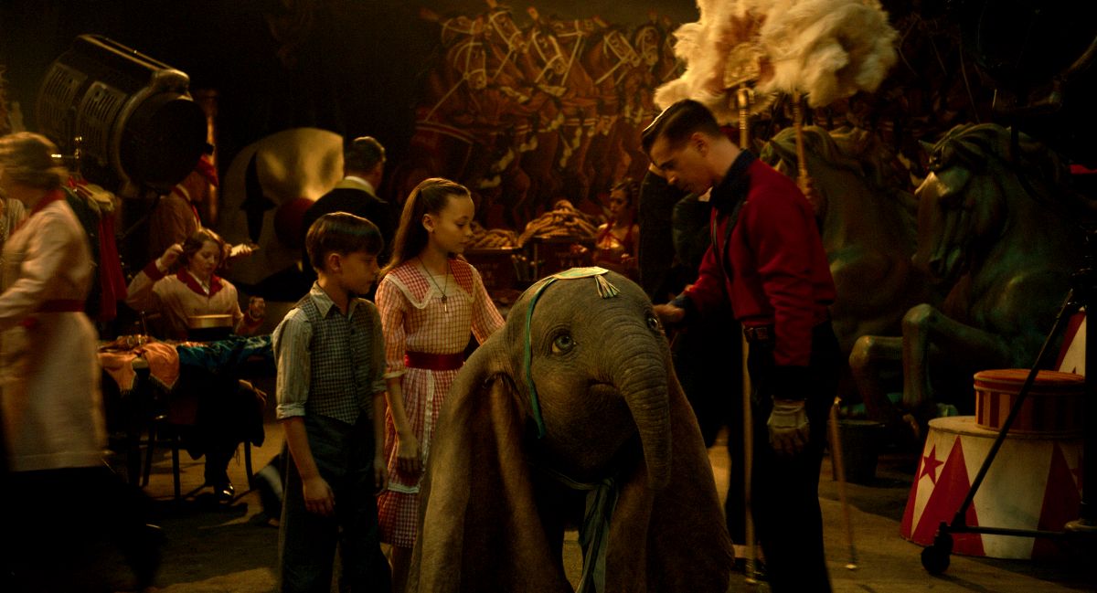
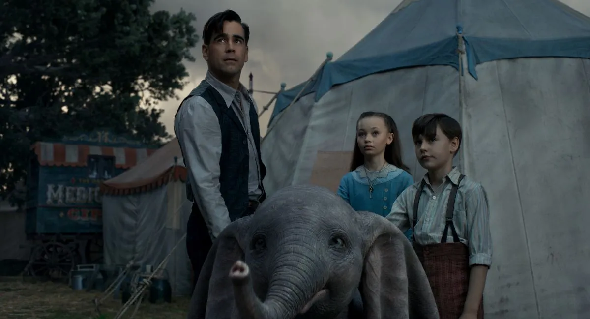
From Disney and visionary director Tim Burton, the all-new grand live-action adventure Dumbo expands on the beloved classic story where differences are celebrated, family is cherished and dreams take flight. Circus owner Max Medici (Danny DeVito) enlists former star Holt Farrier (Colin Farrell) and his children Milly (Nico Parker) and Joe (Finley Hobbins) to care for a newborn elephant whose oversized ears make him a laughingstock in an already struggling circus.
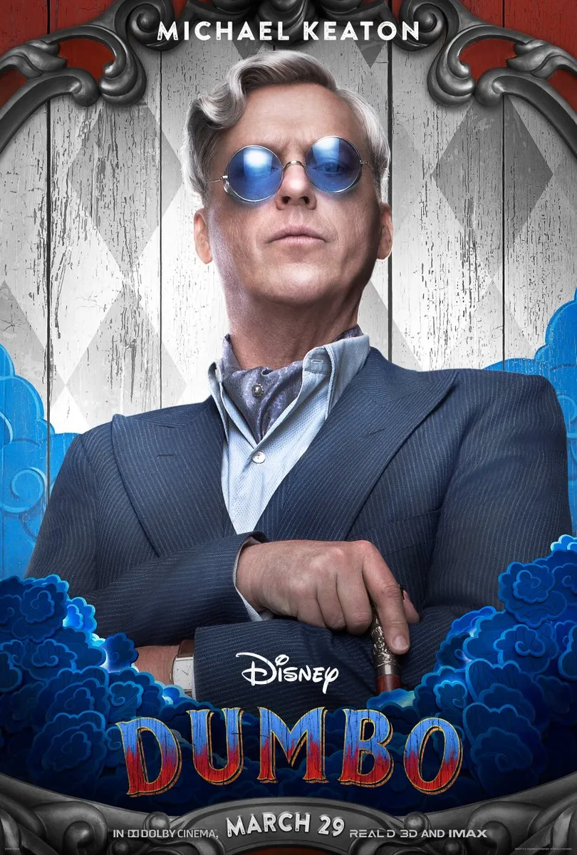
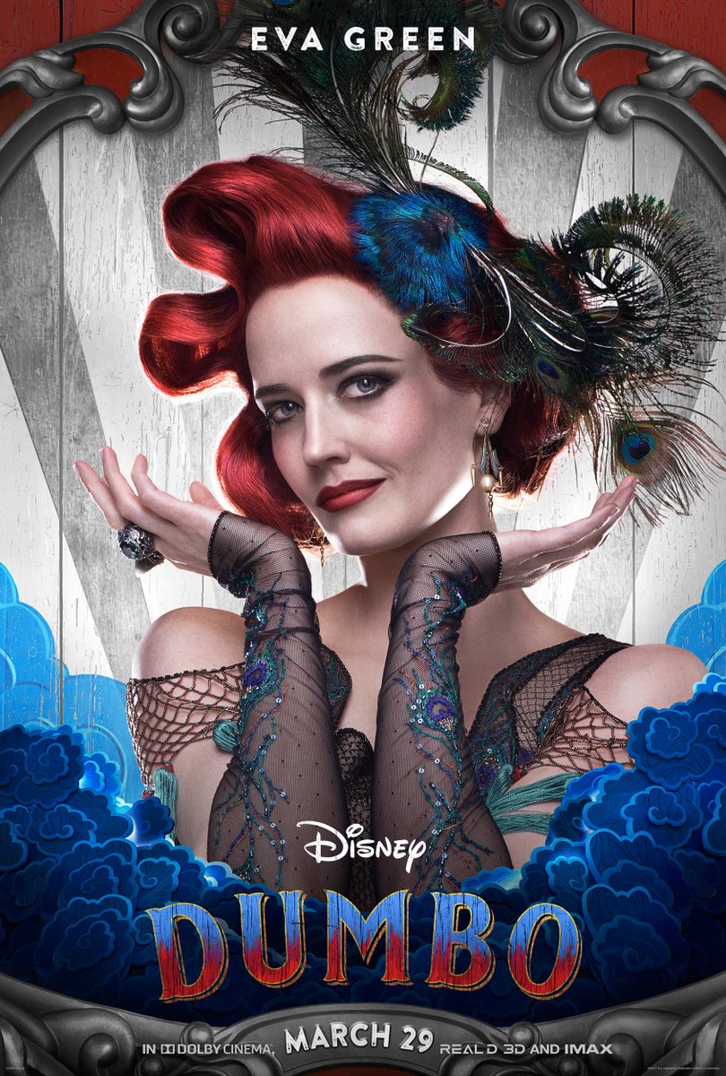
But when they discover that Dumbo can fly, the circus makes an incredible comeback, attracting persuasive entrepreneur V.A. Vandevere (Michael Keaton), who recruits the peculiar pachyderm for his newest, larger-than-life entertainment venture, Dreamland. Dumbo soars to new heights alongside a charming and spectacular aerial artist, Colette Marchant (Eva Green), until Holt learns that beneath its shiny veneer, Dreamland is full of dark secrets.
Dumbo was directed by Tim Burton (Alice in Wonderland, Charlie and the Chocolate Factory) from a screenplay by Ehren Kruger (Ophelia, Dream House).
RELATED: Dumbo Prepares to Take Flight in New Live-Action Trailer from Disney
ComingSoon.net: I heard you were just filming in New Zealand.
Rick Heinrichs: No, not filming. We’re prepping a little something there.
CS: Does it rhyme with “Bavatar”?
Heinrichs: No, it doesn’t, as a matter of fact. It does not. We’re competing with them for stages and resources like that.
CS: But it’s a secret?
Heinrichs: It is right now. Soon to be revealed.
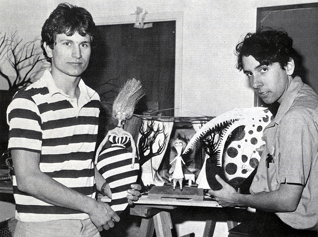
CS: Excellent, excellent. I know you and Tim have been working together for something around four decades, since you guys were at Cal Arts, right?
Heinrichs: That’s right. To be honest with you, just to correct that a little bit, I didn’t really know Tim that well at Cal Arts. I got to know him at Disney, when we were there immediately following that time. He got to Cal Arts a couple of years before I did. And I was only there for a year after I’d already been to school prior to that, so I went directly into the studio after a year at Cal Arts and that’s where Tim and I started working together.
CS: You guys did a lot of work collaborating on things like “Vincent” and “Frankenweenie.” How much of what we think of as the Tim Burton aesthetic is actually the Rick Heinrichs aesthetic?
Heinrichs: Look, the interesting thing about working with Tim is always that there was a shared interest in elements, but he always came at it from a different place. My interests tend to be based in the comic book and animation world. Tim’s were more inspired by 50’s science fiction movies and what I would consider to be bad television, things like that. It works perfectly for Tim because he would always abstract what his inspiration was from those elements and use it as a way to give back something that was unusually different in a cool way. I was always thrilled to see what he would come up with for that. But certainly, in terms of subject matter, that was something that we would explore together. We share a lot of interest in horror movies and science fiction and things that have fantasy elements.
CS: The thing that always strikes me about a lot of your Burton collaborations is there’s always a German expressionist feel. Somebody took “Batman Returns,” which you art-directed, and they turned it sepia. They turned it into a silent movie. And it looks just like a German expressionist movie. Is the German expressionism more your influence or Tim’s?
Heinrichs: We looked at a lot of films together like “The Cabinet of Dr. Caligari,” which is the benchmark of early German expressionism. “Metropolis” and some of those things were always very inspirational, but the thing to take away from that is the expressionism part. Where the German expressionism is much more about strong lighting contrasts and playing with the two dimensional graphic qualities of light on objects as they’re photographed, revealing a three dimensional space as a development of the 2D graphic look is probably the most important aspect that we were influenced by. There’s something very compelling about a black and white movie and the way that it simplifies the image into shape language. So there’s all of that as well. At the end of the day, it’s all about the feeling that you’re trying to put across, if it’s a feeling of unease or horror or even the other side of the spectrum, a warm environment. One of the things that we tried to do on “Dumbo,” and used the expressionism to do it, was put across this idea of the heartland, using both color and lighting to instill warmth and put across the concept of family, which is why that contrasts so much and so clearly with Dreamland, which also, in its own way, was an exercise in making sure that a complex park had a simple graphic quality to it.
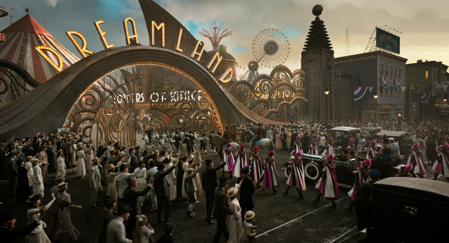
CS: The Dreamland park obviously takes more of its cues from that early 1900’s aesthetic like Coney Island, but is there also an aspect of it where you guys are subtly lampooning the Disneyland of it all?
Heinrichs: Disneyland is deeply embedded in both of our sensibilities, no question about it. I even worked at what was called Red Enterprises at the time, that develops the parks. The idea of theme park rides and any sort of theme in entertainment like that, which is much more about conveying story and character, that’s all done beautifully and with a great deal of genius by Disney and all the people who helped them develop the parks. In terms of lampooning, I think that there’s a bigger sort of villain character, the Xanadu role that some people think that there’s some relationship to Disney. I don’t really see it that way. I think Disney in its early days was very much about supporting those artists and pushing a very clear entertainment agenda. It wasn’t this sort of faceless corporate entity that we tried to put across with Vandevere and the bankers and the group of people around him. So I think that people are assigning a little bit of a character point or a lampoon aspect about Disney that I’ve heard but don’t think is quite appropriate or what we were after, but if there are similarities, it probably would be more to the corporate aspect of it.
CS: As someone who lives in New York, I feel like a lot of the remnants of Coney Island still has a more sinister quality to it. Was there anything that you guys developed visually that was a little too strong, a little too weird for “Dumbo”?
Heinrichs: Oh plenty probably. We’re doing the research for something like this, and I definitely dug into the late 19th century and early 20th century for Coney Island. There was actually a Dreamland that was part of Coney Island at the time. It was much more rooted in the Victorian Pleasure Park aesthetic. That wasn’t quite the right aesthetic that we were going for. We did want something that blew you away, it would take the audience away and awe them and impress them. That just felt a little too rooted in reality. However, I did do a lot of research. I loved the work of Reginald Marsh. She would go to Coney Island and do a lot of sketching of the personalities and people. It was this slightly different thing than what we were after, but it comes through beautifully in his imagery, so that idea of conveying the feeling that the artist was getting from the artwork, that was totally 100 percent what we were after. We were also looking a lot for particular sort of heartland vibe for the Medici circus. We were looking at a lot of Edward Hopper, who is very expressive with his very simple, beautifully painted compositions. There is what I would describe as, not so much a sinister aspect to his work, it’s more of you get a sense of loneliness and isolation. There’s just a really amazing feeling that he’s able to convey that comes right off of his canvases. So we were definitely looking at that as well. And then really also to the expressive work of the original Disney artists who created the story and characters for the original “Dumbo.” Super inspiring, beautiful work from them, all very expressive and all about conveying story and character.
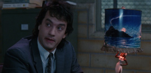
CS: I’ve got to ask about one of my favorite movies of all time which is “Joe Versus the Volcano.” That was an interesting one because you were working with a first time director in John Patrick Shanley, and working under another Tim Burton vet, Bo Welch (production designer). The look of the film seems to have been very inspirational, especially for people like Wes Anderson, with its very proscenium arch, theatrical storybook quality. Can you talk a little bit about developing the very unique look for that film?
Heinrichs: Bo is sort of like a mentor for me. I’d been working with Tim for several years on animated things. When Tim was getting more into live-action I was going with him, on “Frankenweenie” for instance. The first thing that Bo worked on with Tim was “Beetlejuice” and “Edward Scissorhands.” And in that in-between there, Bo got onto different projects. One of them was “Joe Versus the Volcano.” His own sensibility as an architect was similar in a way to the aesthetic that he and Tim were doing on “Beetlejuice” in so far as it was taking an idea and abstracting it to its very simplest elements. I found that incredibly inspiring, his ability to abstract and to convey. And then, particularly on “Joe Versus the Volcano,” once again German Expressionism, themes like lightning bolts became a repeated icon. One of the sets that I designed was Joe working in the office at the beginning of the movie. Bo wanted a sense of compression and then we talked about a forced perspective, where he actually walks up a little bit into this place where he makes coffee out of hot water and freeze-dried milk and he’s got a fluorescent light over his head. The whole thing was to put across this concept of the horrificness of the day-to-day job so that he’s got a way to sort of talk about his fantasy life and what was going on inside of his head. So it’s once again that thing of expressing the character’s innermost thoughts and feelings through their environment and through the character and using the tools of storytelling that aren’t just expository, that invite the audience in instead of telling the audience what to think and feel.
CS: Right. Like the lamp on his desk very much says where his head is at and contrasts with that harsh environment.
Heinrichs: Exactly. His little bit of Dreamland.
Dumbo (live-action)
-
Dumbo
-
Dumbo

-
Dumbo
-
Dumbo
-
Dumbo
-
Dumbo
-
DUMBO
-
Dumbo
-
Dumbo
-
Dumbo
-
Dumbo
-
Dumbo
-
Dumbo
-
DUMBO
ON WITH THE SHOW – When a persuasive entrepreneur decides to make Dumbo a star at his larger-than-life entertainment venture, former circus star Holt Farrier (Colin Farrell) and his children Milly (Nico Parker) and Joe (Finley Hobbins) vow to stick with their beloved flying elephant the whole way. Directed by Tim Burton, Disney’s all-new, live-action, big-screen adventure “Dumbo” flies into theaters on March 29, 2019. ©2018 Disney Enterprises, Inc. All Rights Reserved.
-
DUMBO
CIRCUS FAMILY – In Disney’s all-new live-action adventure “Dumbo,” circus owner Max Medici (Danny DeVito) and circus performer Rongo the Strongo (Deobia Oparai)—plus the rest of their big-top team—welcome a newborn elephant with oversized ears to their tight-knit family. Directed by Tim Burton, “Dumbo” flies into theaters on March 29, 2019. ©2018 Disney Enterprises, Inc. All Rights Reserved.
-
DUMBO
SPECIAL ASSIGNMENT – In director Tim Burton’s all-new live-action adventure “Dumbo,” former circus star Holt Farrier (Colin Farrell) and his children Milly (Nico Parker) and Joe (Finley Hobbins) are charged with caring for a newborn elephant whose oversized ears make him a laughingstock in an already struggling circus. Expanding on the beloved classic story where differences are celebrated, family is cherished and dreams take flight, “Dumbo” flies into theaters on March 29, 2019. ©2018 Disney Enterprises, Inc. All Rights Reserved.
-
DUMBO
THAT’S SHOW BUSINESS – In Disney’s all-new, live-action feature film “Dumbo,” persuasive entrepreneur V.A. Vandevere (Michael Keaton) recruits a flying elephant named Dumbo for his newest, larger-than-life entertainment venture, Dreamland. Dumbo soars to new heights alongside a stunning aerial artist, Colette Marchant (Eva Green). But Holt Farrier (Colin Farrell), who was originally enlisted to care for Dumbo with his kids (Nico Parker and Finley Hobbins), soon discovers that beneath its shiny veneer, Dreamland is full of dark secrets. Directed by Tim Burton, “Dumbo” flies into theaters on March 29, 2019. ©2018 Disney Enterprises, Inc. All Rights Reserved.
-
DUMBO
EARS TO YOU – In Disney’s all-new, live-action feature film “Dumbo,” a newborn elephant with oversized ears make him a laughingstock in an already struggling circus. But Dumbo takes everyone by surprise when they discover he can fly. Directed by Tim Burton, “Dumbo” flies into theaters on March 29, 2019. ©2018 Disney Enterprises, Inc. All Rights Reserved.
-
DUMBO
MAKING A STAR – In Disney’s all-new, live-action feature film “Dumbo,” persuasive entrepreneur V.A. Vandevere (Michael Keaton) convinces struggling circus owner Max Medici (Danny DeVito) that they can make a star out of Medici’s flying elephant. Directed by Tim Burton, “Dumbo” flies into theaters on March 29, 2019. ©2018 Disney Enterprises, Inc. All Rights Reserved.
-
DUMBO
CLOWNING AROUND -- In Tim Burton’s all-new, live-action reimagining of “Dumbo,” circus owner Max Medici (Danny DeVito) calls on former circus star Holt Farrier (Colin Farrell) to care for a newborn elephant whose oversized ears make him a laughingstock in an already struggling circus. Holt ultimately takes his task very seriously—even donning a clown suit to help the flying elephant as he emerges as a star. Daughter Milly (Nico Parker) just might be Dumbo’s biggest fan. “Dumbo” flies into theaters on March 29, 2019. Photo by Jay Maidment. © 2018 Disney Enterprises, Inc. All Rights Reserved.
-
DUMBO
BUILDING DREAMS -- In Tim Burton’s all-new, live-action reimagining of “Dumbo,” persuasive entrepreneur V.A. Vandevere (Michael Keaton) decides that a young elephant from a struggling circus belongs in his newest, larger-than-life entertainment venture, Dreamland, alongside charming and spectacular aerial artist Colette Marchant (Eva Green). Directed by Burton and produced by Katterli Frauenfelder, Derek Frey, Ehren Kruger and Justin Springer, “Dumbo” flies into theaters on March 29, 2019. Photo by Jay Maidment. © 2018 Disney Enterprises, Inc. All Rights Reserved.
-
DUMBO
MEET MEDICI -- In Tim Burton’s all-new, live-action reimagining of “Dumbo,” struggling circus owner Max Medici (Danny DeVito) is disappointed to learn that a newborn elephant has enormous ears. But when Medici realizes that the elephant can fly, the circus’ return to prosperity suddenly becomes a real possibility. Directed by Burton and produced by Katterli Frauenfelder, Derek Frey, Ehren Kruger and Justin Springer, Disney’s all-new, live-action reimagining of “Dumbo” flies into theaters on March 29, 2019. Photo by Jay Maidment © 2018 Disney Enterprises, Inc. All Rights Reserved.
-
DUMBO
PERFORMING PAIR -- In Tim Burton’s all-new, live-action reimagining of “Dumbo,” former circus star Holt Farrier (Colin Farrell) is tapped to care for a newborn elephant with oversized ears. But when everyone learns that the elephant can fly, Holt finds himself—and Dumbo—in the middle of a new, larger-than-life entertainment venture, Dreamland, alongside charming and spectacular aerial artist Colette Marchant (Eva Green). “Dumbo” flies into theaters on March 29, 2019. Photo by Jay Maidment. © 2018 Disney Enterprises, Inc. All Rights Reserved.
-
DUMBO
FAMILY TIES – In Tim Burton’s all-new, live-action reimagining of “Dumbo,” Holt Farrier (Colin Farrell), with the help of his children Milly (Nico Parker) and Joe (Finley Hobbins), is called on to take care of a newborn elephant whose oversized ears make him a laughingstock in an already struggling circus. Holt’s circus family includes Miss Atlantis (Sharon Rooney), Rongo (DeObia Oparei), Pramesh’s nephew (Ragevan Vasan), Pramesh Singh (Roshan Seth), Catherine the Greater (Zenaida Alcalde) and Ivan the Wonderful (Miguel Muñoz). “Dumbo” opens in theaters on March 29, 2019. © 2018 Disney Enterprises, Inc. All Rights Reserved.
-
DUMBO
DREAMING BIG -- In Tim Burton’s all-new, live-action reimagining of “Dumbo,” persuasive entrepreneur V.A. Vandevere (Michael Keaton) decides that a young elephant from a struggling circus belongs in his newest, larger-than-life entertainment venture, Dreamland. Directed by Burton and produced by Katterli Frauenfelder, Derek Frey, Ehren Kruger and Justin Springer, “Dumbo” flies into theaters on March 29, 2019. © 2018 Disney Enterprises, Inc. All Rights Reserved.
-
DUMBO
WHEN I SEE AN ELEPHANT FLY -- In Tim Burton’s all-new, live-action reimagining of “Dumbo,” former circus star Holt Farrier (Colin Farrell) and his children (Nico Parker and Finley Hobbins) find themselves caring—and advocating—for a newborn elephant whose oversized ears make him a laughingstock in an already struggling circus. Directed by Burton and produced by Katterli Frauenfelder, Derek Frey, Ehren Kruger and Justin Springer, “Dumbo” flies into theaters on March 29, 2019. © 2018 Disney Enterprises, Inc. All Rights Reserved.
-
DUMBO
TRUE LOVE -- When former circus star Holt Farrier (Colin Farrell) is charged with taking care of a newborn elephant whose oversized ears make him a laughingstock in an already struggling circus, he’s surprised by just how quickly his children (Finley Hobbins and Nico Parker) fall for the peculiar pachyderm. Directed by Tim Burton and produced by Katterli Frauenfelder, Derek Frey, Ehren Kruger and Justin Springer, Disney’s all-new, live-action reimagining of “Dumbo” flies into theaters on March 29, 2019. © 2018 Disney Enterprises, Inc. All Rights Reserved.
-
Dumbo
GOTTA FLY – Visionary filmmaker Tim Burton helms the live-action reimagining of Disney’s 1941 animated classic “Dumbo.” “’Dumbo’ was always one of my favorite Disney films,” said Burton. “We’re trying to give it the same heart, feeling and emotion that we all loved about the original.” Starring Colin Farrell, Michael Keaton, Danny DeVito, Eva Green, Nico Parker and Finley Hobbins, “Dumbo” is currently in production in England. © 2017 Disney Enterprises, Inc. All Rights Reserved.
-
Dumbo
-
Dumbo at D23 Expo 2017
-
Dumbo at D23 Expo 2017
-
Dumbo


